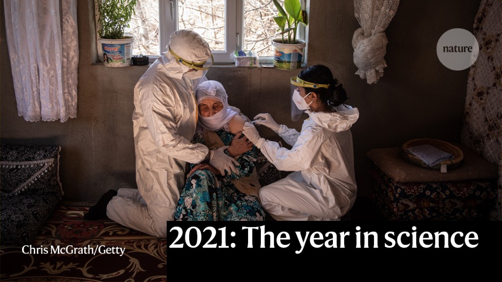
How COVID Vaccines Shaped 2021 in Eight Powerful Charts
The extraordinary vaccination of more than four billion people, and the lack of access for many others, were major forces this year - while Omicron's arrival complicated things further.
Send us a link
The extraordinary vaccination of more than four billion people, and the lack of access for many others, were major forces this year - while Omicron's arrival complicated things further.
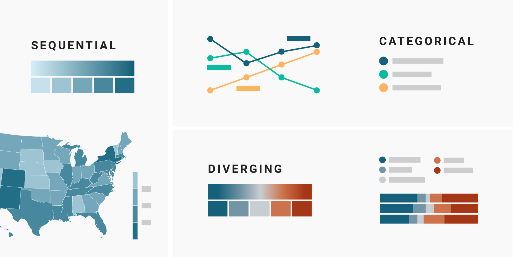
A short overview of the different color scales (diverging, sequential, categorical) that you can use to visualize your data.
The article discusses how the interpretation of 'performance' from a presentation using accurate but summary bibliometrics can change when iterative deconstruction and visualization of the same dataset is applied.
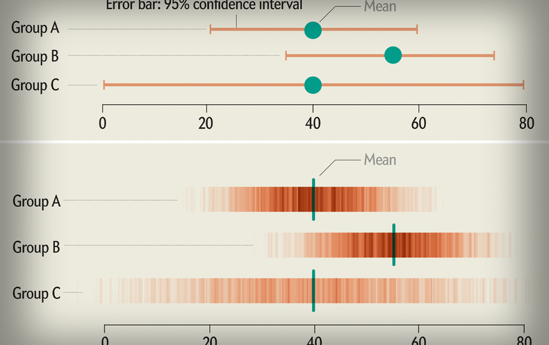
These “raincloud plots” can visualize raw data, probability density, and key summary statistics such as median, mean, and relevant confidence intervals in an appealing and flexible format with minimal redundancy.
Investments in research that produce scientific and scholarly data can be leveraged by enabling the resulting research data products and services to be used by broader communities and for new purposes.
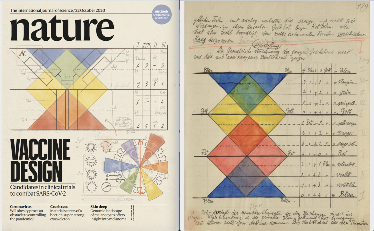
The recent nature issue publishes findings from leading researchers on an urgent quest for a vaccine against SARS-Cov-2. Here ist how the cover image was created, drawing on aspects of Bauhaus artist Paul Klee’s famous notebooks to reimagine the quest for a vaccine against SARS-CoV-2.
A data visualization charts the positions in the sky of the Hubble Space Telescope’s plethora of cosmic targets.
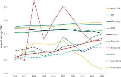
The scientific literature is riddled with bad charts and graphs, leading to misunderstanding and worse. Avoiding design missteps can improve understanding of research.
External and internal collaboration patterns are presented.
Data-visualization techniques can clarify the uncertainty in information or make it more confusing if not implemented well.
The connections between scholarly resources generated by persistent identifiers (PIDs) and associated metadata form a graph: the PID Graph. Today we are announcing another important milestone: we added the required functionality to the DataCite GraphQL API that allows us to keep track of the growth of the PID Graph in terms of nodes (resources) and edges (connections).
JetFighter screens preprints to improve data representation and colour-blind accessibility.

Over the past year, we've fundamentally changed how we produce graphics.
A guide to making visualizations that accurately reflect the data, tell a story, and look professional.
Information-aesthetic explorations of emerging patterns in scientific citation networks. A cooperation between the Eigenfactor® Project (data analysis) and Moritz Stefaner (visualization).